

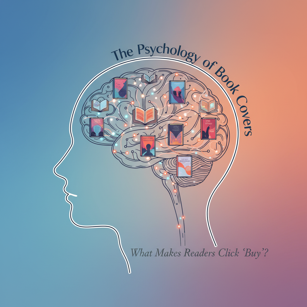
Book Cover Design is the first psychological handshake between your book and a potential reader. Before a blurb is read or a sample is opened, the brain is already making rapid decisions about genre, quality, emotional promise, and even author credibility. For authors navigating crowded digital storefronts like Amazon KDP, understanding the psychology behind Book Cover Design is no longer optional. It is one of the most measurable and controllable levers you have for increasing clicks, conversions, and long-term discoverability.
This guide is written for authors who want real results. Not vague aesthetic advice. Not personal taste. Instead, we will explore what eye-tracking research, typography psychology, and genre signaling actually reveal about reader behavior. We will also connect these insights directly to KDP marketing data and documented cover redesign case studies. Throughout the article, you will find practical steps you can apply immediately, even if you are not a designer.
The First Three Seconds That Decide Everything
Book Cover Design operates inside a brutal attention economy. According to Nielsen Norman Group, users form an impression of visual content in as little as 50 milliseconds. That is 0.05 seconds.
On Amazon specifically, shoppers often scroll quickly through dozens of book thumbnails. Eye-tracking studies conducted by the Nielsen Norman Group and the University of Hamburg show that users scan in predictable patterns, focusing first on high-contrast areas, then on faces, and then on large, readable text.
This means your Book Cover is not being appreciated slowly. It is being judged instantly. Therefore, the primary goal of Book Cover Design is not beauty. It is clarity.
Readers are subconsciously asking three questions in under three seconds:
- What genre is this?
- What emotional experience am I being promised?
- Does this look professional and trustworthy?
If your cover does not answer all three immediately, the click often never happens.
Book Cover Design Through the Lens of Eye Tracking Studies
Eye tracking research gives us some of the most actionable insights into Book Cover Design. These studies track where users look first, how long they linger, and what they ignore.
Visual Hierarchy
According to Nielsen Norman Group eye tracking studies, users prioritize visual hierarchy in this order.
- Dominant image or focal point
- High contrast areas
- Large typography
- Faces and eyes
- Color blocks
For Book Cover Design, this means clutter is dangerous. Covers that attempt to communicate too many ideas simultaneously often fail because the eye cannot resolve a clear focal point.
If your cover includes multiple characters, background elements, textures, and decorative fonts, it is likely fighting itself. Strong Book Cover Design usually has one clear subject and one clear emotional signal.
Book Cover Design and Faces
Multiple eye tracking studies show that human faces draw attention faster than any other visual element.
However, there is an important nuance for Book Covers. Faces increase attention but only when they align with genre expectations.
For example:
- Romance covers benefit significantly from faces and body language.
- Thrillers often perform better with partial faces or obscured figures.
- Fantasy may prioritize symbols or environments over faces.
This is where Book Cover Design becomes psychological rather than artistic. A beautifully illustrated face can still harm conversion if it sends the wrong genre signal.

Book Cover Design and Typography Psychology
Typography is one of the most underestimated elements of Book Cover Design. Yet it carries enormous psychological weight.
Font Perception
Research from the Journal of Marketing Communications shows that typography influences perceived credibility, emotional tone, and genre alignment.
Key findings include:
- Serif fonts are associated with tradition, seriousness, and literary value.
- Sans serif fonts signal modernity, clarity, and accessibility.
- Script fonts convey intimacy, romance, or elegance, but reduce readability at small sizes.
- Blocky or distressed fonts increase perceptions of tension and danger.

For Book Cover Design, readability at thumbnail size is non-negotiable. Amazon itself confirms that most shoppers first see covers at very small sizes.
Test your cover at the size of a postage stamp on your phone. If the title is unreadable, conversions will suffer no matter how beautiful the full-size version looks.
Book Cover Design and Genre Signaling
Genre signaling is the single most important job of Book Cover Design.
According to a 2023 KDP author survey analyzed by Written Word Media, readers are more likely to click books that visually match their genre expectations.
This does not mean every cover should look identical. It means your Book Cover Design must look familiar enough to feel safe.
Cognitive Fluency
Cognitive fluency refers to how easy something is to mentally process. Research published in Psychological Science shows that people prefer things that are easier to process and feel familiar.
In Book Cover Design, cognitive fluency explains why readers gravitate toward covers that resemble books they already love.
This directly connects to our WriteStats analysis in:
Why Readers Take Chances on Unknown Authors And How to Position Your Books for Discovery
Readers are not avoiding new authors. They are avoiding uncertainty.
Study the top 100 books in your primary Amazon category. Identify repeating visual elements. This is not copying. This is speaking the visual language readers already understand.
Color Psychology That Actually Converts
Color psychology is often misused in Book Cover Design discussions. Not because color does not matter, but because context matters more.
Color Expectations by Genre
Multiple studies in marketing psychology show that color meaning is context dependent.
In Book Cover Design, genre overrides universal color rules.
Examples:
- Romance frequently uses warm tones like pinks, purples, and soft blues.
- Thrillers favor high contrast with blacks, reds, and whites.
- Fantasy often uses saturated blues, golds, and mystical lighting.
- Literary fiction leans toward muted palettes and minimalist design.
Do not choose colors based on personal preference. Choose them based on genre norms first, then add subtle differentiation.
Amazon KDP Data Insights
Amazon does not publicly release all conversion data, but enough verified insights exist to guide authors intelligently.
Click Through Rates
According to internal testing reported by Kindlepreneur and corroborated by KDP case studies, cover redesigns alone can increase click-through rates by 20 to 50 percent when the original cover fails genre signaling.
Additionally, Amazon A+ content and Sponsored Ads heavily rely on visual appeal. If your Book Cover does not convert impressions into clicks, ad costs increase and visibility decreases.
This directly ties into the data-driven marketing principles discussed in:
Data-Driven Book Marketing: How Using Data Can Transform Author Success
Your cover is not branding. It is performance marketing.

Book Cover Design Case Studies That Changed Sales Trajectories
Case Study One: Romance Redesign
A romance author, documented by Written Word Media, redesigned her cover from an illustrated style to a photo-based cover with a clear couple and high-contrast typography.
Result: Sales increased by 35% within 30 days.
Why it worked: The new Book Cover aligned with current romance market expectations.
Emotional clarity replaced artistic ambiguity.
Case Study Two: Thriller Redesign
A thriller author reported that they replaced a complex, illustrated scene with a minimalist cover featuring a bold title and a single, symbolic object.
Result: Click-through rates doubled on Amazon ads.
Why it worked: The Book Cover Design reduced cognitive load and increased visual tension.
Book Cover Design and Trust Signals Readers Notice
Readers subconsciously evaluate professionalism in milliseconds. According to a Stanford Web Credibility study, visual design accounts for 75% of credibility judgments.
In Book Covers, trust signals include:
- Clean typography alignment
- Consistent margins
- High resolution imagery
- Genre-appropriate composition
- Amateur design signals include
- Overcrowded layouts
- Low-resolution images
- Mismatched fonts
- Unclear focal points
If your cover looks self-published, readers assume the writing may be unedited. This is unfair, but data supported.
Book Cover Design Step by Step: What Authors Should Actually Do
This section translates psychology into action.
Step One: Define Your Primary Genre Precisely
Do not choose multiple genres. Choose one primary category that drives your Book Cover Design.
Step Two: Audit the Top 50 Covers in That Genre
Look for patterns in:
- Color palettes
- Typography style
- Image composition
Step Three: Prioritize Thumbnail Readability
Test your cover at small sizes on mobile.
Step Four: Get Objective Feedback
Avoid asking friends and family. Instead, use reader-focused groups or paid cover testing tools.
Step Five: Iterate Based on Data
Monitor:
- Click-through rates
- Ad performance
- Category ranking changes
Book Cover Design is not permanent. Treat it as a living asset.
Book Cover Design and Long-Term Author Branding
While each book must signal genre clearly, consistency across a series builds recognition.
According to Amazon KDP marketing guidance, series branding increases read-through rates.
Consistent elements include:
- Font family
- Layout structure
- Color logic
This supports reader trust and simplifies future marketing.
Book Cover Design Is Not Art, It Is Communication
Book Cover Design succeeds when it disappears, when readers feel drawn, informed, and emotionally primed without consciously analyzing why.
The psychology is clear.
Eye tracking rewards clarity.
Typography shapes trust.
Genre signaling reduces risk.
Data-driven iteration increases sales.
Authors who embrace Book Cover Design as a psychological tool rather than a personal expression consistently outperform those who do not.
And most importantly, Book Cover Design is learnable.
When authors align visual psychology with reader expectations and measurable data, covers stop being guesswork and start becoming growth engines.
If you treat your Book Cover with the same seriousness as your writing craft, the results compound.
Quietly. Reliably. And measurably.


